import pandas as pd
df = pd.read_csv("...")
Univariate plotting with pandas
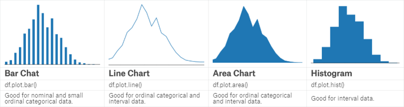 Bar chart可以方便地显示每个分类数据的数量、频率等。
df.value_counts().plot.bar()
# relative proportions
(df.value_counts() / len(df)).plot.bar()
# sorted
df.value_counts().sort_index().plot.bar()
Line chart可用于显示连续变量或者独立变量的分布等。
df.value_counts().sort_index().plot.line()
Area chart相当于在line chart下加了阴影以显示面积。
df.value_counts().sort_index().plot.area()
Histogram更多地用于显示定距数据。
df.plot.hist()
Bivariate plotting with pandas
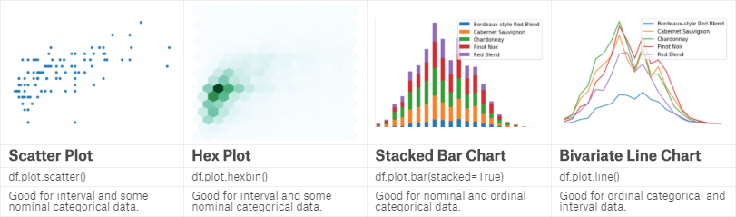 Scatter plot是最常见的双变量图,可清晰显示两个变量之间的关系。
df.plot.scatter(x='A', y='B')
Hex plot用六角形显示数据,比较新颖,而且可以用颜色深浅表明数量。
df.plot.hexbin(x='A', y='B', gridsize=15)
Stacked plot多用于分组数据,显示各组别之间的数量、比例关系,bar、area、line均可。
df_count = df.groupby(...)
df_count.plot.bar(stacked=True)
df_count.plot.area()
df_count.plot.line()
Styling your plots
常用的一些调节plot的参数如,figsize=(width, height)控制整体图像大小,color='...'设置颜色,fontsize=...设置字体大小,title='...'设置标题等。另外,matplotlib和seaborn等库也提供很好的显示方案。
Subplots
有时候我们需要在一张大图里呈现多个子图,这时可使用matplotlib提供的相应函数。
import matplotlib.pyplot as plt
fig, axarr = plt.subplots(2, 2, figsize=(12, 8))
df['A'].value_counts().sort_index().plot.bar(ax=axarr[0][0], fontsize=12, color='mediumvioletred')
axarr[0][0].set_title("Subplots_A", fontsize=18)
df['B'].value_counts().head(20).plot.bar(ax=axarr[1][0], fontsize=12, color='mediumvioletred')
axarr[1][0].set_title("Subplots_B", fontsize=18)
df['C'].value_counts().head(20).plot.bar(ax=axarr[1][1], fontsize=12, color='mediumvioletred')
axarr[1][1].set_title("Subplots_C", fontsize=18)
df['D'].value_counts().plot.hist(ax=axarr[0][1], fontsize=12, color='mediumvioletred')
axarr[0][1].set_title("Subplots_D", fontsize=18)
plt.subplots_adjust(hspace=.3)
Plotting with seaborn
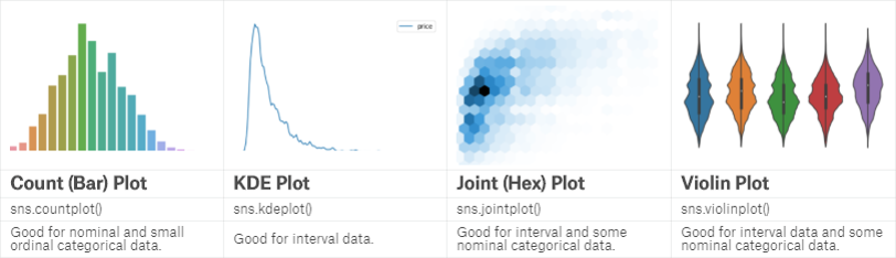 seaborn也是一个很好用的图形显示的包。
import seaborn as sns
# pandas bar chart
sns.countplot(df)
# kernel density estimate
sns.kdeplot(df)
# pandas histogram
sns.distplot(df, bins=10, kde=False)
# pandas scatterplot and hexplot
sns.jointplot(x='...', y='...', data=df)
sns.jointplot(x='...', y='...', data=df, kind='hex', gridsize=20)
# boxplot and violin plot
sns.boxplot(x='...', y='...', data=df)
sns.violinplot(x='...', y='...', data=df)
Faceting with seaborn
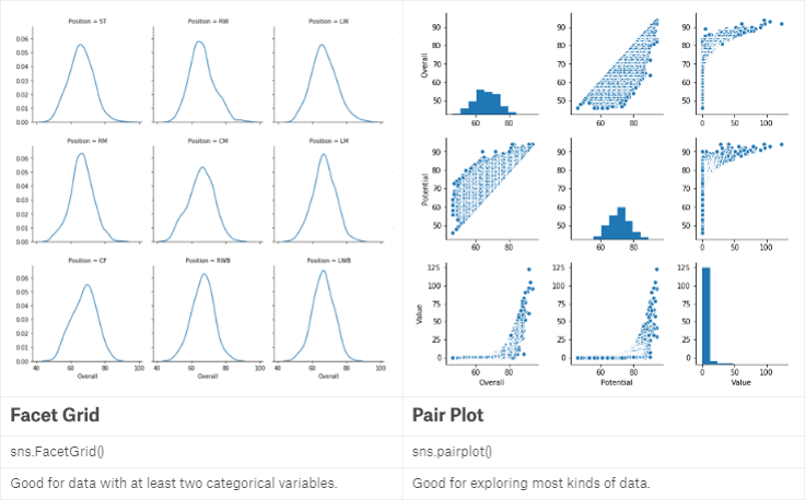 当我们希望指定一个或两个变量,考察其不同组别之间的关系并放在同一张图中时,就用到了FacetGrid:
import seaborn as sns
# one row
g = sns.FacetGrid(df, col="A", col_wrap=6)
g.map(sns.kdeplot, "C")
# comparing two categories
g = sns.FacetGrid(df, row="A", col="B")
g.map(sns.violinplot, "C")
当我们希望将多组变量进行两两关系对比时,就用到了pairplot:
sns.pairplot(df[['A', 'B', 'C']])
Multivariate plotting
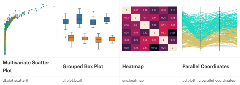 当面对多组数据时,我们可添加颜色或是形状作为新的维度来使用scatter plot:
import seaborn as sns
sns.lmplot(x='A', y='B', markers=['o', 'x', '*'], hue='C', data=df, fit_reg=False)
Boxplot在显示分组数据时也十分有用:
sns.boxplot(x='A', y='B', hue='C', data=df)
Heatmap则常用于表现数据之间相关性大小等:
sns.heatmap(df, annot=True)
Parallel coordinates plot则是另一种表现组间数据分布的图:
from pandas.plotting import parallel_coordinates
parallel_coordinates(df, 'A')
Introduction to plotly
前面所述均为静态图,但在网页等环境中,我们可以使用交互图,如plotly。plotly提供了在线和离线两种模式,这里以离线为例:
from plotly.offline import init_notebook_mode, iplot
init_notebook_mode(connected=True)
import plotly.graph_objs as go
# scatter plot
iplot([go.Scatter(x=df['A'], y=df['B'], mode='markers')])
# iplot takes a list of plot objects and composes them
iplot([go.Histogram2dContour(x=df['A'], y=df['B'], contours=go.Contours(coloring='heatmap')),
	go.Scatter(x=df['A'], y=df['B'], mode='markers')])
Grammar of graphics with plotnine
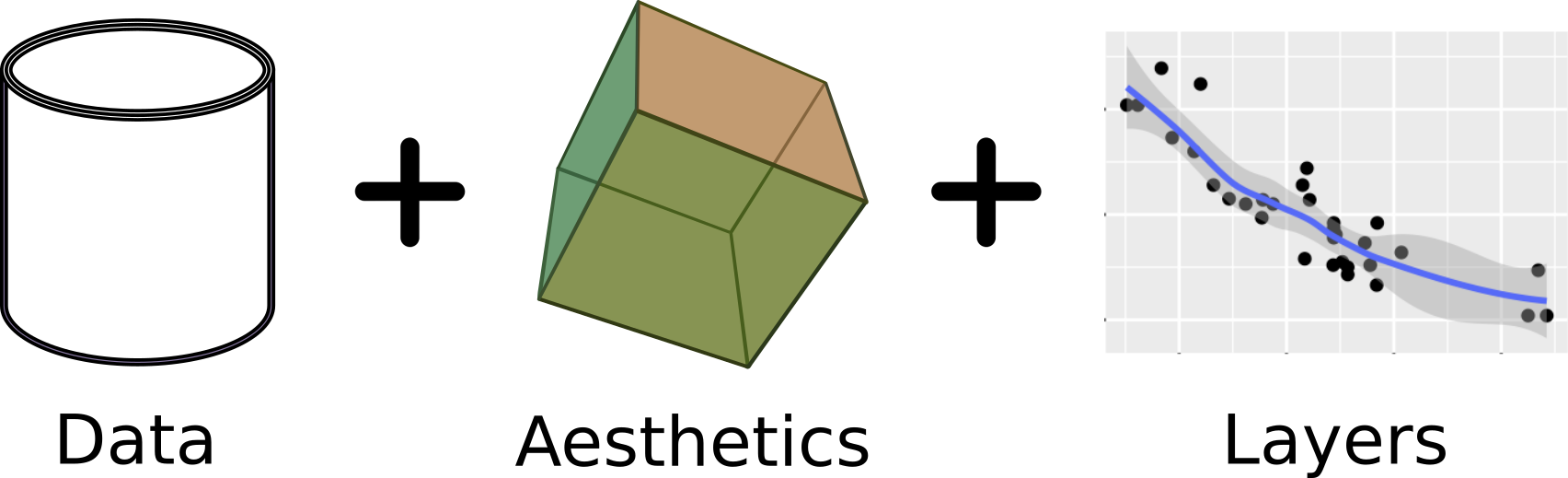 在R里有ggplot2这样一个强大的工具,在python里我们可以使用plotnine。
from plotnine import *
(ggplot(df) # data
	+ aes('A', 'B') # aesthetic
	+ aes(color='A')
	+ geom_point() # layer
	+ stat_smooth() # add a regression line
	+ facet_wrap('~C')
)
Time-series plotting
时序数据是一类重要的数据集,比如股市、基因表达等。常见的line、bar等均有使用,这里介绍几个新的作图方式。
Lag plot绘制y和y+1之间的数值关系:
from pandas.plotting import lag_plot
lag_plot(stocks['volume'])
Autocorrelation plot提供了y和y+n之间的相关性:
from pandas.plotting import autocorrelation_plot
autocorrelation_plot(stocks['volume'])