延续上一章,本章接着介绍heatmaps、scatter、histogram数据作图。
Heatmaps
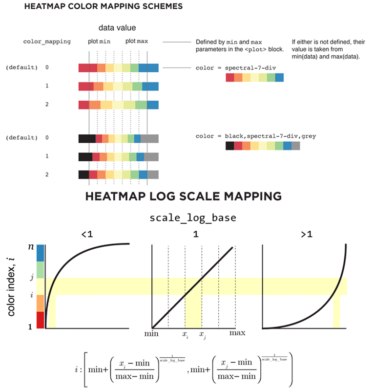
热图能够直观地显示不同样本、位点之间的差异及聚类情况,是一个展示基因组不同区域不同特性的有效手段,常用于基因表达差异、表观遗传修饰差异等多种分析中。Circos通过type = heatmap的<plot>子模块来实现热图,其基本数据格式除了要求染色体名称和起始终止位置外,还应有value一栏,以示数据值的大小。我们先看一下其参数设置:
show_heatmaps	= yes
<plots>

<plot>
show			= conf(show_heatmaps)
# 表示这是一个heatmap类型的plot
type			= heatmap
file			= data/heatmap1.txt
# 蓝色基调的9色面板
color			= blues-9-seq
# Circos需要将数据文件中的数值进行映射进min和max区间,从而赋予不同颜色,这就需要考虑下面两个因素
# 一是不同颜色区间的分配,由参数color_mapping设置
# 二是线性/非线性映射,由参数scale_log_base设置,默认为线性映射,不需设置该值
# 这些不同可参见下图
min			= 0
max			= .20e6
# r0和r1为热图的显示半径
r0			= 0.765r
r1			= 0.785r
# 每个色块边缘颜色及宽度
stroke_color		= white
stroke_thickness	= 1p
</plot>

<plot>
show			= conf(show_heatmaps)
type			= heatmap
file   			= data/heatmap2.txt
color			= reds-9-seq
min			= 0
max			= .20e6
r0			= 0.79r
r1			= 0.81r
stroke_color		= white
stroke_thickness	= 1p
</plot>

<plot>
show			= conf(show_heatmaps)
type			= heatmap
file			= data/heatmap3.txt
color			= blues-9-seq
min			= 0
max			= .10e6
r0			= 0.895r
r1			= 0.915r
stroke_color		= white
stroke_thickness	= 1p
</plot>

<plot>
show			= conf(show_heatmaps)
type			= heatmap
file			= data/heatmap4.txt
color			= reds-9-seq
min			= 0
max			= .10e6
r0			= 0.92r
r1			= 0.94r
stroke_color		= white
stroke_thickness	= 1p
</plot>

</plots>
这里可以看一下官网提供的关于颜色映射问题的示意图:
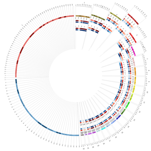
 我们先来看上面设置的heatmaps效果:
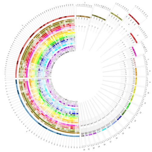
 但是会发现,上面4组heapmaps几乎用了一模一样的参数却设置了4遍,这样既麻烦又容易出错。Circos为这种情况提供了自动计数工具,下面举个例子。首先,我们新建立一个配置文件heatmap.chain.conf:
<plot>
# 设置变量chain,默认从0开始计数,这里的“:1”即累加1
pre_increment_counter	= chain:1
# 用counter调用当前数值,输入不同数据文件
file			= data/heatmap.counter(chain).txt
show			= conf(show_heatmaps)
type			= heatmap
min			= 6000
max			= 50000
# 同样利用counter设置颜色、位置半径等
color		= eval(join(",",map { sprintf("chr%d_a%d",counter(chain),$_) } (5,4,3,2,1) ))
r0		= eval(sprintf("%fr",0.99-counter(chain)*.025-.02))
r1		= eval(sprintf("%fr",0.99-counter(chain)*.025))
stroke_thickness	= 0

<rules>
<rule>
# 前章提到Circos中是按照从前至后的顺序进行rule判断的,而importance可用来改变该判断顺序
# 即importance值越高,顺序越靠前,未设置importance的则放在最后依序判断
importance		= 100
condition		= var(value) < 2000
show			= no
</rule>
<rule>
importance		= 95
condition		= var(value) < 6000
color			= vvlgrey
stroke_color		= black
stroke_thickness	= 1
</rule>
</rules>
</plot>
关于counter的详细信息可查看官网。接下来,我们在主配置文件circos.conf中进行多重include操作即可:
show_heatmaps	= yes
<plots>
# 多重操作,具体看引入的数据情况,下图一共需22个
<<include heatmap.chain.conf>>
<<include heatmap.chain.conf>>
<<include heatmap.chain.conf>>
...

</plots>
这样设置简明清晰、易于管理,来看一下效果:
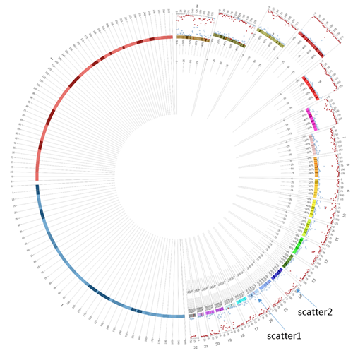
Scatter
散点图恐怕是工作中最常用的数据图之一了,而在Circos中我们需要重新理解其坐标轴,x轴可看作是染色体,y轴则是设置显示的径向区域,这样一来,我们就可以利用type = scatter的<plot>子模块方便地显示不同数值点。下面举个例子:
show_scatter		= yes
<plots>

# scatter1
<plot>
show			= conf(show_scatter)
# 表示这是一个scatter类型的plot
type			= scatter
file			= data/scatter1.txt
# r0和r1为散点图的显示半径
r0			= 1r
r1			= 1r+180p
# 显示的数据值范围
max			= .5e6
min			= 0
# 点的形状
glyph			= square
glyph_size		= 6
# 不设置color则点为空心
color			= undef
# glyph边缘的颜色和粗细
stroke_color		= blues-5-seq-5
stroke_thickness	= 1
</plot>

# scatter2
<plot>
show			= conf(show_scatter)
type			= scatter
file			= data/scatter2.txt
r0			= 1r
r1			= 1r+180p
max			= .5e6
min			= 0
glyph			= triangle
glyph_size		= 8
color			= reds-5-seq-5
# 表示数据展示方向,默认为out即由里向外
orientation		= in
</plot>

</plots>
看一下效果:
 接下来我们考虑这样一件事,既然Circos中散点图的y轴是其显示区域的径向范围,那么令
r0 = r1就可以产生不一样的显示效果,同时我们借助上面counter的用法,绘制另一种scatter图。首先新建立两个配置文件,scatter.chain.mm.conf:
<plot>
show			= conf(show_scatter)
# 设置变量mmchainscatter,从0开始计数,累加1
pre_increment_counter	= mmchainscatter:1
type			= scatter
glyph			= circle
glyph_size		= 5
min			= 0
max			= 1e6
# 可以看到,这里实际r0 = r1,且所有的配置中该值均未变
r0			= eval(sprintf("1r+%dp",90-0*counter(mmchainscatter)))
r1			= eval(sprintf("1r+%dp",90-0*counter(mmchainscatter)))
file			= data/scatter.mm.counter(mmchainscatter).txt
# 不设置颜色使其为空心
color			= undef

<rules>
<rule>
condition		= 1
# 注意这里的id实际是数据文件第5列里自定义的变量
stroke_color		= eval(sprintf("%s",var(id)))
stroke_thickness	= 3
glyph_size		= eval(remap_int(var(value),0,1e5,15,180))
</rule>
</rules>
</plot>
以及scatter.chain.rn.conf:
<plot>
show			= conf(show_scatter)
pre_increment_counter	= rnchainscatter:1
type			= scatter
glyph			= circle
glyph_size		= 15
min			= 0
max			= 1e6
# 与上面不同,这里虽然r0 = r1,但该值随着rnchainscatter而变
r0			= eval(sprintf("1r+%dp",180-30*counter(rnchainscatter)))
r1			= eval(sprintf("1r+%dp",180-30*counter(rnchainscatter)))
file			= data/scatter.rn.counter(rnchainscatter).txt
color			= black

<rules>
<rule>
condition		= 1
# 注意这里的id实际是数据文件第5列里自定义的变量
color			= eval(sprintf("%s",var(id)))
glyph_size		= eval(remap_int(var(value),0,1e5,5,45))
</rule>
</rules>
</plot>
然后在主配置文件circos.conf中进行多重include操作:
show_scatter	= yes
<plots>
# 多重操作,下图一共需22个
<<scatter.chain.mm.conf>>
<<scatter.chain.mm.conf>>
...
# 多重操作,下图一共需5个
<<scatter.chain.rn.conf>>
<<scatter.chain.rn.conf>>
...
</plots>
效果如下:
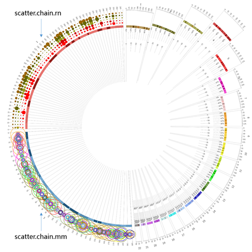 可见对于数据可视化来说,想象力很重要。
Histogram
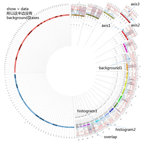
直方图常用来显示数据的分布、累积等差异。在某些时候,直方图与散点图存在共同之处(因为可以把点看作是直方的顶部),因而对histogram的设置来说,可以参考scatter:
show_histogram	= yes
<plots>

# histogram1
<plot>
show			= conf(show_histogram)
# 表示这是一个histogram类型的plot
type			= histogram
file			= data/histogram1.txt
# 显示的数据值范围,范围之外的不显示
min			= 0
max			= .5e6
# 是否设置histogram的底色
fill_under		= yes
# 蓝色基调的5色面板中的第4个色,aN表示透明度为N/6,这里即5/6 = 83%
fill_color		= blues-5-seq-4_a5
# 显示区域
r0			= 1r
r1			= 1r+180p
# 设置方向为由内之外
orientation		= out

# 背景设置可用于任意plot模块,既可以与其它图形并用,也可以单独存在
<backgrounds>
# 表示只在有数据的部分显示
show			= data

#background1
<background>
# 颜色设置
color			= vvlgrey
# 注意在background中,范围设置使用y0和y1
y0			= 0.4r
y1			= 0.6r
</background>
</backgrounds>

# 坐标轴的设置指y轴,径向
# 可用于任意plot模块,既可以与其它图形并用,也可以单独存在
<axes>
# 表示只在有数据的部分显示
show			= data
thickness		= 1

# axis1
<axis>
# 尺度
spacing		= 0.05r
color			= vlgrey
# 在特定位置上不显示
position_skip		= 0.25r,0.35r
</axis>

# axis2
<axis>
spacing		= 0.1r
# 注意在axis中,范围设置使用y0和y1
y0			= 0.3r
y1			= 0.7r
color			= grey
</axis>

# axis3
<axis>
# 在特定位置上显示,这里一个是数据值,一个是histogram图的径向范围的相对值
position		= .3e6,0.55r
color			= red
thickness		= 2
</axis>
</axes>
</plot>

# histogram2
<plot>
show			= conf(show_histogram)
type			= histogram
file			= data/histogram2.txt
r1			= 1r+180p
r0			= 1r
max			= .5e6
min			= 0
fill_under		= yes
fill_color		= reds-5-seq-4_a5
orientation		= in
</plot>

</plots>
最后,我们看一下显示效果:
 经过这四章,我们大概能够应付基本的Circos作图了(plot中还有tile、line、connector等就不一一介绍了),然而唯有熟能生巧,只有不断地尝试再尝试,才能发现更多有意思的高阶用法。在这个数据为大,展示为先的时代,望Circos的使用能给我们的工作添光增色。